Sign up
This component is used to create a new user account and is only available for a triggered email link generated by staff or the user itself.
Developer notes
Assets
You can provide a custom image path to components. But, if you want to globalize this image, you can follow the cdsSource pattern. For more information, please refer to the CDS Source documentation.
(e.g. for logo branding, background image, etc.)
Web Components
To use a web component, make sure that you have imported the javascript file in your HTML file. For more information, follow the Web components guide.
Also, have followed the Web Component Configuration guide.
Suggested route path
The example bellow follows angular 17 standards. To a better understanding of how to use or import them, please refer to the Angular documentation.
We suggest the following route path structure:
- ROUTER
- MODULE
import { BfmSignUpComponent, BfmSignUpSuccessComponent } from "@celerofinancas/ui-auth";

export const AUTH_ROUTES: Route[] = [
  {
    path: "signup/:token",
    component: BfmSignUpComponent,
  },
  {
    path: "signup/success",
    component: BfmSignUpSuccessComponent,
  },
  // ...
];
  export const ROUTES: Route[] = [
    {
      path: 'auth',
      loadChildren: () => import('./auth/auth.routing').then(mod => mod.AUTH_ROUTES)
    },
    // ...
  ];
Explanation
The signup component will always be accessed through a token, which is generated by the system and sent to the user's email. The token is used to validate the user's email and create a new account. Also is a one-time token, so it can only be used once.
The feedback screen is displayed after the user creates a new account successfully.
BfmSignUpComponent
This section describes the BfmSignUpComponent component.
Composition
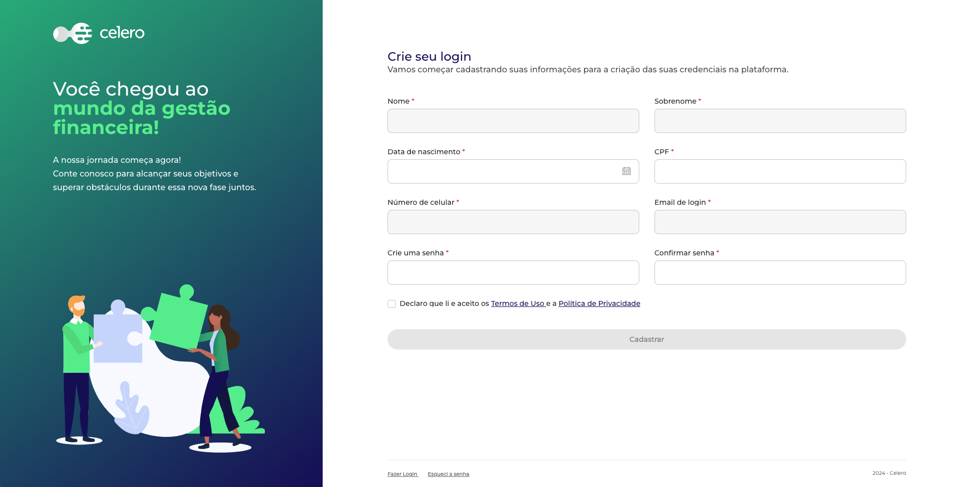
The BfmSignUpComponent component is composed of the following components:
- BfmSignUpFormComponent - The form used to create a new user account.
- BfmSignUpAsideComponent - The aside of the page.
- BfmSignUpFooterComponent - The footer of the page.
Usage
To use the BfmSignUpComponent, you need to import it in your component:
- Angular
- Web Component
import { BfmSignUpComponent } from "@celerofinancas/ui-auth";

@Component({
  standalone: true,
  selector: 'auth-signup',
  imports: [BfmSignUpComponent],
  templateUrl: './signup.component.html',
})
export class SignUpComponent {}
Then, you can use the BfmSignUpComponent in your template:
<auth-signup/>
refer to Web Components.
If you want to use the BfmSignUpComponent as a web component, you can import in your HTML file as follows:
<auth-signup/>
Inputs
The BfmSignUpComponent has the following inputs:
logo
The URL of the logo to be displayed in the sign-up screen.
- Accepts a string in
cdsSourcepattern.
refer to Assets notes
| Type | Default |
|---|---|
string | assets/shared/logo-white.svg |
asideImage
The URL of the image to be displayed in the aside of the sign-up screen.
- Accepts a string in
cdsSourcepattern.
refer to Assets notes
| Type | Default |
|---|---|
string | assets/auth/sign-up.svg |
asideTitle
The title to be displayed in the aside of the sign-up screen.
| Type | Default |
|---|---|
string | Você chegou ao mundo da gestão financeira! |
asideDescription
The description to be displayed in the aside of the sign-up screen.
| Type | Default |
|---|---|
string | A nossa jornada começa agora. Conte conosco para alcançar seus objetivos e superar obstáculos durante essa nova fase juntos. |
signUpTitle
The title to be displayed in the sign-up form.
| Type | Default |
|---|---|
string | Crie seu login |
signUpDescription
The description to be displayed in the sign-up form.
| Type | Default |
|---|---|
string | Vamos começar cadastrando suas informações para a cria�ção das suas credenciais na plataforma. |
signUpButton
The text to be displayed in the sign-up button.
| Type | Default |
|---|---|
string | Cadastrar |
footerText
The text to be displayed in the footer.
| Type | Default |
|---|---|
string | {{ currentYear }} - {{ platformName }} |
Events
The BfmSignUpComponent emits the following events:
signUp
Emitted when user finishes the sign-up process, before of the being redirected to the feedback screen.
| Type |
|---|
EventEmmiter |
Example
Customize texts in sign-up flow:
- HTML
- TS
<auth-signup
  asideTitle="Valorize o seu dinheiro!"
  asideDescription="Conte com a gente!"
  signUpTitle="Seja bem-vindo!"
  signUpDescription="Insira suas informações para começar a usar a plataforma."
  signUpButton="Inscrever-se"
  footerText="IB Name"
></auth-signup>
import { BfmSignUpComponent } from "@celerofinancas/ui-auth";

@Component({
  standalone: true,
  selector: 'auth-signup',
  imports: [BfmSignUpComponent],
  templateUrl: './signup.component.html',
})
export class SignUpComponent {}
BfmSignUpFormComponent
This section describes the BfmSignUpFormComponent component.
Composition
The BfmSignUpFormComponent is composed of the following fields:
The disabled fields are filled with user's information, which is already registered in the system.
This information is retrieved from URL token.
- Title and description of the form.
- Form fields:
- Name (disabled)
- Last name (disabled)
- Birthdate
- CPF
- Phone number (disabled)
- Email (disabled)
- Password
- Confirm password
- Terms and conditions checkbox
- Sign-up button
The component will automatically validate URL token and form fields, including password validation (following Password Validation rules) and terms and conditions checkbox.
Also, will handle form submission and redirect user to the feedback screen.
If you need any kind of customization that is not covered by inputs, you can create a new component to handle this. But, you need to integrate with backend to save data. Please refer to the BFM Core documentation for more information.
Also, you will need to handle all validations, redirects and error messages.
Usage
To use the BfmSignUpFormComponent, you need to import it in your component:
- Angular
- Web Component
import { BfmSignUpFormComponent } from "@celerofinancas/ui-auth";

@Component({
  standalone: true,
  selector: 'auth-signup',
  imports: [BfmSignUpFormComponent],
  templateUrl: './signup.component.html',
})
export class SignUpComponent {}
Then, you can use the BfmSignUpFormComponent in your template:
<auth-signup-form></auth-signup-form>
refer to Web Components.
If you want to use the BfmSignUpFormComponent as a web component, you can import in your HTML file as follows:
<auth-signup-form></auth-signup-form>
Inputs
The BfmSignUpFormComponent has the following inputs:
title
The title to be displayed in sign-up form.
| Type | Default |
|---|---|
string | Crie seu login |
description
The description to be displayed in sign-up form.
| Type | Default |
|---|---|
string | Vamos começar cadastrando suas informações para a criação das suas credenciais na plataforma. |
textButton
The text to be displayed in sign-up button.
| Type | Default |
|---|---|
string | Cadastrar |
enableTokenValidation
By default, the URL token will be validated. If token is invalid, the user will be redirected to login.
| Type | Default |
|---|---|
boolean | true |
enableTermsAndConditions
Controls the visibility of the terms and conditions checkbox.
| Type | Default |
|---|---|
boolean | true |
When user clicks on the terms and conditions link, a modal will be displayed with the terms and conditions text.
formFields
You can customize the form fields to be displayed in the sign-up form. But, be careful with the order and the required fields.
The form fields to be displayed in the sign-up form.
| Type |
|---|
| SignUpFormField[] |
Default value:
import { SignUpFormField } from '@celerofinancas/ui-auth';
import { Validators, AbstractControl } from '@angular/forms';

public formFields: SingUpFormField[] = [
    {
      control: 'token',
      field: false,
    },
    {
      control: 'first_name',
      validator: Validators.required,
      label: 'Nome',
      field: true,
      disabled: true,
      required: true,
    },
    {
      control: 'last_name',
      validator: Validators.required,
      label: 'Sobrenome',
      field: true,
      disabled: true,
      required: true,
    },
    {
      control: 'birth_date',
      label: 'Data de nascimento',
      validator: [
        Validators.required,
        (control: AbstractControl) => {
          const age = differenceInYears(new Date(), new Date(control.value));
          return age < 18 ? { custom: 'Você deve ter mais de 18 anos para prosseguir' } : null;
        },
      ],
      field: true,
      specialInput: true,
      required: true,
    },
    {
      testId: 'identity-number',
      label: 'CPF',
      control: 'identity_number',
      mask: this.mask.strictCpf,
      field: true,
      disabled: this.isMaster,
      required: true,
      validator: [
        Validators.required,
        (control: AbstractControl) =>
          control.value && !isCPFValid(control.value) ? { custom: 'CPF inválido.' } : null,
      ],
    },
    {
      label: 'Número de celular',
      control: 'full_phone',
      mask: this.mask.phone,
      required: true,
      field: true,
      disabled: true,
      validator: [
        Validators.required,
        (control: AbstractControl) =>
          control.value && !isPhoneValid(control.value)
            ? { custom: 'Telefone inválido.' }
            : null,
      ],
    },
    {
      control: 'email',
      label: 'Email de login',
      field: true,
      disabled: !this.isMaster,
      required: true,
      validator: [Validators.required, Validators.email],
    },
    {
      control: 'password',
      validator: [
        Validators.required,
        (control: AbstractControl) =>
          Passwords.isStrongPassword(control.value) ? null : { hiddenError: true },
      ],
      label: 'Crie uma senha',
      field: true,
      required: true,
    },
    {
      control: 'confirmPassword',
      validator: Validators.required,
      label: 'Confirmar senha',
      field: true,
      required: true,
    },
    {
      control: 'privacy_policy_version',
      validator: Validators.required,
      label: null,
      field: false,
      required: true,
    },
  ];
Events
The BfmSignUpFormComponent emits the following events:
signUp
Emitted when user finishes the sign-up process, before of the being redirected to the feedback screen.
| Type |
|---|
EventEmmiter |
Example
Customize form fields in sign-up flow:
- HTML
- TS
<auth-signup-form
  title="Seja bem-vindo!"
  description="Insira suas informações para começar a usar a plataforma."
  textButton="Inscrever-se"
  [formFields]="customFormFields"
></auth-signup-form>
import { BfmSignUpFormComponent } from "@celerofinancas/ui-auth";
import { Validators, AbstractControl } from '@angular/forms';

@Component({
  standalone: true,
  selector: 'auth-signup',
  imports: [BfmSignUpFormComponent],
  templateUrl: './signup.component.html',
})
export class SignUpComponent {
  public customFormFields: SingUpFormField[] = [
    {
      control: 'token',
      field: false,
    },
    {
      control: 'first_name',
      validator: Validators.required,
      label: 'Nome',
      field: true,
      disabled: true,
      required: true,
    },
    {
      control: 'last_name',
      validator: Validators.required,
      label: 'Sobrenome',
      field: true,
      disabled: true,
      required: true,
    },
    {
      control: 'birth_date',
      label: 'Data de nascimento',
      validator: [
        Validators.required,
        (control: AbstractControl) => {
          const age = differenceInYears(new Date(), new Date(control.value));
          return age < 18 ? { custom: 'Você deve ter mais de 18 anos para prosseguir' } : null;
        },
      ],
      field: true,
      specialInput: true,
      required: true,
    },
    {
      testId: 'identity-number',
      label: 'CPF',
      control: 'identity_number',
      mask: this.mask.strictCpf,
      field: true,
      disabled: this.isMaster,
      required: true,
      validator: [
        Validators.required,
        (control: AbstractControl) =>
          control.value && !isCPFValid(control.value) ? { custom: 'CPF inválido.' } : null,
      ],
    },
    {
      label: 'Número de celular',
      control: 'full_phone',
      mask: this.mask.phone,
      required: true,
      field: true,
      disabled: true,
      validator: [
        Validators.required,
        (control: AbstractControl) =>
          control.value && !isPhoneValid(control.value)
            ? { custom: 'Telefone inválido.' }
            : null,
      ],
    },
    {
      control: 'email',
      label: 'Email de login',
      field: true,
      disabled: !this.isMaster,
      required: true,
      validator: [Validators.required, Validators.email],
    },
    {
      control: 'password',
      validator: [
        Validators.required,
        (control: AbstractControl) =>
          Passwords.isStrongPassword(control.value) ? null : { hiddenError: true },
      ],
      label: 'Crie uma senha',
      field: true,
      required: true,
    },
    {
      control: 'confirmPassword',
      validator: Validators.required,
      label: 'Confirmar senha',
      field: true,
      required: true,
    },
    {
      control: 'privacy_policy_version',
      validator: Validators.required,
      label: null,
      field: false,
      required: true,
    },
    // Custom field
    {
      control: 'newsletter',
      label: 'Desejo receber novidades por e-mail',
      field: true,
      required: false,
    }
  ];
}
BfmSignUpAsideComponent
This section describes the BfmSignUpAsideComponent component.
Composition
The BfmSignUpAsideComponent component is composed of the following fields:
- Image
- Title
- Description
Usage
- Angular
- Web Component
To use the BfmSignUpAsideComponent, you need to import it in your component:
import { BfmSignUpAsideComponent } from "@celerofinancas/ui-auth";

@Component({
  standalone: true,
  selector: 'auth-signup',
  imports: [BfmSignUpAsideComponent],
  templateUrl: './signup.component.html',
})
export class SignUpComponent {}
Then, you can use the BfmSignUpAsideComponent in your template:
<bfm-signup-aside></bfm-signup-aside>
refer to Web Components.
If you want to use the BfmSignUpAsideComponent as a web component, you can import in your HTML file as follows:
<bfm-signup-aside></bfm-signup-aside>
Inputs
The BfmSignUpAsideComponent has the following inputs:
image
The URL of the image to be displayed in the aside.
- Accepts a string in
cdsSourcepattern.
| Type | Default |
|---|---|
string | assets/auth/sign-up.svg |
refer to Assets notes
title
The title to be displayed in the aside.
| Type | Default |
|---|---|
string | Você chegou ao mundo da gestão financeira! |
description
The description to be displayed in the aside.
| Type | Default |
|---|---|
string | A nossa jornada começa agora. Conte conosco para alcançar seus objetivos e superar obstáculos durante essa nova fase juntos. |
Events
The BfmSignUpAsideComponent component has no events.
Example
Customize aside in sign-up flow:
- HTML
- TS
<bfm-signup-aside
  title="Valorize o seu dinheiro!"
  description="Conte com a gente!"
></bfm-signup-aside>
<bfm-signup-form></bfm-signup-form>
import { BfmSignUpAsideComponent } from "@celerofinancas/ui-auth";

@Component({
  standalone: true,
  selector: 'auth-signup',
  imports: [BfmSignUpAsideComponent],
  templateUrl: './signup.component.html',
})
export class SignUpComponent {}
BfmSignUpFooterComponent
This section describes the BfmSignUpFooterComponent component.
Composition
The BfmSignUpFooterComponent component is composed of the following fields:
- Text
- Router links
Usage
To use the BfmSignUpFooterComponent, you need to import it in your component:
- Angular
- Web Component
import { BfmSignUpFooterComponent } from "@celerofinancas/ui-auth";

@Component({
  standalone: true,
  selector: 'auth-signup',
  imports: [BfmSignUpFooterComponent],
  templateUrl: './signup.component.html',
})
export class SignUpComponent {}
Then, you can use the BfmSignUpFooterComponent in your template:
<bfm-signup-footer></bfm-signup-footer>
refer to Web Components.
If you want to use the BfmSignUpFooterComponent as a web component, you can import in your HTML file as follows:
<bfm-signup-footer></bfm-signup-footer>
Inputs
The BfmSignUpFooterComponent has the following inputs:
text
The text to be displayed in the footer.
| Type | Default |
|---|---|
string | {{ currentYear }} - {{ platformName }} |
routerLinks
The router links to be displayed in the footer.
| Type | Default |
|---|---|
| RouterLink[] | [{ label: 'Fazer login', link: '/auth/signin' }] |
Events
The BfmSignUpFooterComponent component has no events.
Example
Customize footer in sign-up flow:
- HTML
- TS
<main>
  <bfm-signup-aside></bfm-signup-aside>
  <section>
    <bfm-signup-form></bfm-signup-form>
    <bfm-signup-footer
      text="IB Name"
      [routerLinks]="links"
    ></bfm-signup-footer>
  </section>
</main>
import { BfmSignUpFooterComponent, RouterLink } from "@celerofinancas/ui-auth";

@Component({
  standalone: true,
  selector: 'auth-signup',
  imports: [BfmSignUpFooterComponent],
  templateUrl: './signup.component.html',
})
export class SignUpComponent {
  public links: RouterLink[] = [
    { label: 'Fazer login', link: '/auth/signin' },
    { label: 'Esqueci minha senha', link: '/auth/forgot-password' }
  ];
}
BfmSignUpSuccessComponent
The feedback screen is displayed after the user creates a new account successfully.
Composition
The BfmSignUpSuccessComponent component is composed of the following components and fields:
- BfmSignUpAsideComponent - The aside of the page.
- BfmSignUpFooterComponent - The footer of the page.
- Success message
You can create a your own feedback screen, just make sure that it declareted in the auth.routing.ts file following the Suggested route path pattern.
Usage
To use the BfmSignUpSuccessComponent, you need to import it in your component:
- Angular
- Web Component
import { BfmSignUpSuccessComponent } from "@celerofinancas/ui-auth";

@Component({
  standalone: true,
  selector: 'signup-success',
  imports: [BfmSignUpSuccessComponent],
  templateUrl: './signup.component.html',
})
export class SignUpSuccessComponent {}
Then, you can use the BfmSignUpSuccessComponent in your template:
<bfm-feedback-screen></bfm-feedback-screen>
refer to Web Components.
If you want to use the BfmSignUpSuccessComponent as a web component, you can import in your HTML file as follows:
<bfm-feedback-screen></bfm-feedback-screen>
Inputs
asideImage
The URL of the image to be displayed in the aside of the feedback screen.
- Accepts a string in
cdsSourcepattern.
refer to Assets notes
| Type | Default |
|---|---|
string | assets/auth/sign-up.svg |
asideTitle
The title to be displayed in the aside of the feedback screen.
| Type | Default |
|---|---|
string | Você chegou ao mundo da gestão financeira! |
asideDescription
The description to be displayed in the aside of the feedback screen.
| Type | Default |
|---|---|
string | A nossa jornada começa agora. Conte conosco para alcançar seus objetivos e superar obstáculos durante essa nova fase juntos. |
successMessage
The message to be displayed in the feedback screen.
| Type | Default |
|---|---|
string | Tudo pronto! |
successDescription
The description to be displayed in the feedback screen.
| Type | Default |
|---|---|
string | Agora você já pode fazer o login na plataforma clicando no botão abaixo. |
buttonText
The text to be displayed in the button.
| Type | Default |
|---|---|
string | Fazer login na plataforma |
footerText
The text to be displayed in the footer.
| Type | Default |
|---|---|
string | {{ currentYear }} - {{ platformName }} |
Events
buttonClick
Emitted when user clicks on the button.
| Type |
|---|
EventEmmiter |
Example
Customize feedback message:
- HTML
- TS
<bfm-feedback-screen
  asideTitle="Valorize o seu dinheiro!"
  asideDescription="Conte com a gente!"
  successMessage="Muito bem!"
  successDescription="Seu cadastro foi realizado com sucesso! Agora você já pode fazer o login na plataforma."
  buttonText="Fazer login na plataforma"
  footerText="IB Name"
></bfm-feedback-screen>
import { BfmSignUpSuccessComponent } from "@celerofinancas/ui-auth";

@Component({
  standalone: true,
  selector: 'signup-success',
  imports: [BfmSignUpSuccessComponent],
  templateUrl: './signup.component.html',
})
export class SignUpSuccessComponent {}